Dashboard Design: 5 Pitfalls to Avoid
 As the benefits of performance measurement become more broadly known, analysts are seeing a tremendous uptick in the number of organizations that are implementing data visualization frameworks like executive dashboards to showcase key measures of financial and operational performance. But effectively highlighting a lot of information within a small space can be daunting.
A dashboard is a visual display of key performance metrics that are consolidated and arranged on a single screen to enable viewers (business users) to easily monitor them at a glance. Unfortunately, the end result of many dashboard design projects is poor visualization that doesn’t fulfill the dashboard’s intended objectives.
So what are some common pitfalls in dashboard design? Here are 5 that come to mind:
- A very common mistake is starting off with too much complexity. It’s very easy to get caught up in creating a highly detailed, KPI monitoring dashboard with too many options for viewers to get to the core of the presented data. I ascribe to the KISS principle – Keep It Simple and Straight-Forward.
- Taking it further, too much complexity can also lead to the data being separated into multiple screens or into different instances of a single screen. This can make it very cumbersome for users, especially for executives who want to be able to view your company’s performance status at a glance. However, enabling your dashboards to link to other performance views that allow users to navigate to further details concerning specific KPIs can be very powerful.
STEER CLEAR OF DASHBOARD “CLUTTER”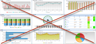
- Another common dashboard design blunder is to use gadgets or widgets like speedometers and gauges that may not lend any context to the data in terms of letting you see if your KPIs are on track, better than in the past or worse than projected.
- In designing the dashboard, some people avoid using the same type of visual representation of a KPI multiple times for the sake of offering up more “visual variety” to viewers. However, if it works in favor of the information intended for representation, the visualization mechanism should be employed as often as needed. Usability trumps variety here! Data visualization should offer viewers the information they require in the most direct and understandable manner. At the bottom line, they should be able to assess different KPIs using a visual display that’s both intuitive and interactive for them.
- Another common faux pas in designing visual representations of KPIs is not displaying data from the “zero” level, which can create a distorted view of the data and a significant discrepancy between the KPI’s real and perceived values.
Following are a few best practices that we’ve put to the test as we’ve launched sales and operational performance dashboards for our customers.
- Try as best you can to display your key metrics on a single screen so people don’t have to move between screens or scroll around on a single display to see all of the information. A performance portal site featuring “tabbed” dashboard pages by individual operational area (e.g., Sales, Purchasing, Inventory, Customer Service, Manufacturing) is also an effective way to go if you’re looking to share your performance metrics on more of a cross-enterprise level with your key stakeholders.
- Even though you don’t want to split a dashboard into multiple screens, including hyperlinks to additional views of performance data that may be of further interest to your viewers as they investigate the details behind their KPIs is highly recommended.
- Be sure that the display media you use (like graphs) communicate performance information directly, clearly, accurately, rapidly and with enough context to make the visualization meaningful. After all, a picture that doesn’t tell the story isn’t worth publishing in the first place.
- Try to put visual emphasis on the information that most requires the viewer’s attention. This can include the use of indicators, color-highlighted text and other graphical formats designed to make dashboard viewers sit up and take notice.
- And, focus the dashboard display more on what is currently happening rather than what has happened in the past. Past performance measures can be effectively used in drill-down links to help users dig deeper into the data in order to assess trends over time.
I wish you all the best with your dashboard endeavors!