Good Data Visualization Makes for Better Business Decisions
 In a recent study of more than 400 IT organizations using Enterprise Performance Management (EPM) solutions, 26% of large companies have implemented dashboards and scorecards over the last several years, with another 13% implementing them currently underway. Mid-size companies are following suit, with 15% currently implementing dashboards and scorecards, and another 34% of mid-sized companies in the process of evaluating them.
The ability to visualize data is a critical concern for many of those looking to invest in business intelligence software.
In fact, BI review firm Software Advice’s 2014 Data Visualization Software BuyerView report found that “…when asked which [BI] applications they wanted, 70 percent of these buyers said they were seeking dashboard or data visualization solutions with reporting capabilities.”
Not surprisingly, industries like manufacturing and healthcare and those that deal with never-ending sets of data are well suited for better data visualization capabilities. As highlighted in the report, these types of businesses often deal with Excel spreadsheets for data analysis; and without data visualization capabilities large data sets like these don’t mean anything to the human eye.
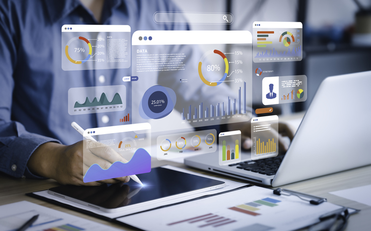
Visualizing data can make it easier for business users to grasp, especially when data visualizations are embedded in dashboards. Executive dashboards help BI system users visualize complicated, complex data, and assist upper-level management in directing and managing business growth and performance by providing a snapshot of current conditions and early warnings for potential issues.
More enhanced drill-down dashboards give business intelligence software users the added power to understand more about what’s driving the numbers. The actionable insights provided by more advanced data visualizations like this empowers decision makers to quickly identify and focus on drivers in key business areas. For example, marketing and sales managers can leverage data visualization to not only rank their customers by profitability, but to break that down visually by more sophisticated factors that influence profitability, including customer AR trends, returns, amount of repeat orders, complaints, and more.
According to the Software Advice report, 25 percent of buyers want the ability to “drill down” or “slice and dice” their data using visual methods like this.
Dashboards should allow users to drill down to at least one if not more levels of data to gain a detailed view behind KPIs, metrics, and visual objects. Users should be able to spot anomalies easily and recognize where performance is out of line with expectations. More mature and successful dashboard implementations will allow users not only to drill down into data, but also to perform various types of analysis to explore patterns or determine the root cause for performance anomalies.
As it stands today, there’s lots of room to grow in this area. But at the bottom line, good data visualization enables better business decisions when correctly deployed.